uxhotels UX Design Case Study
The goal of the project was to design a hotel booking website.
I completed this project as part of a Diploma in UX Design.
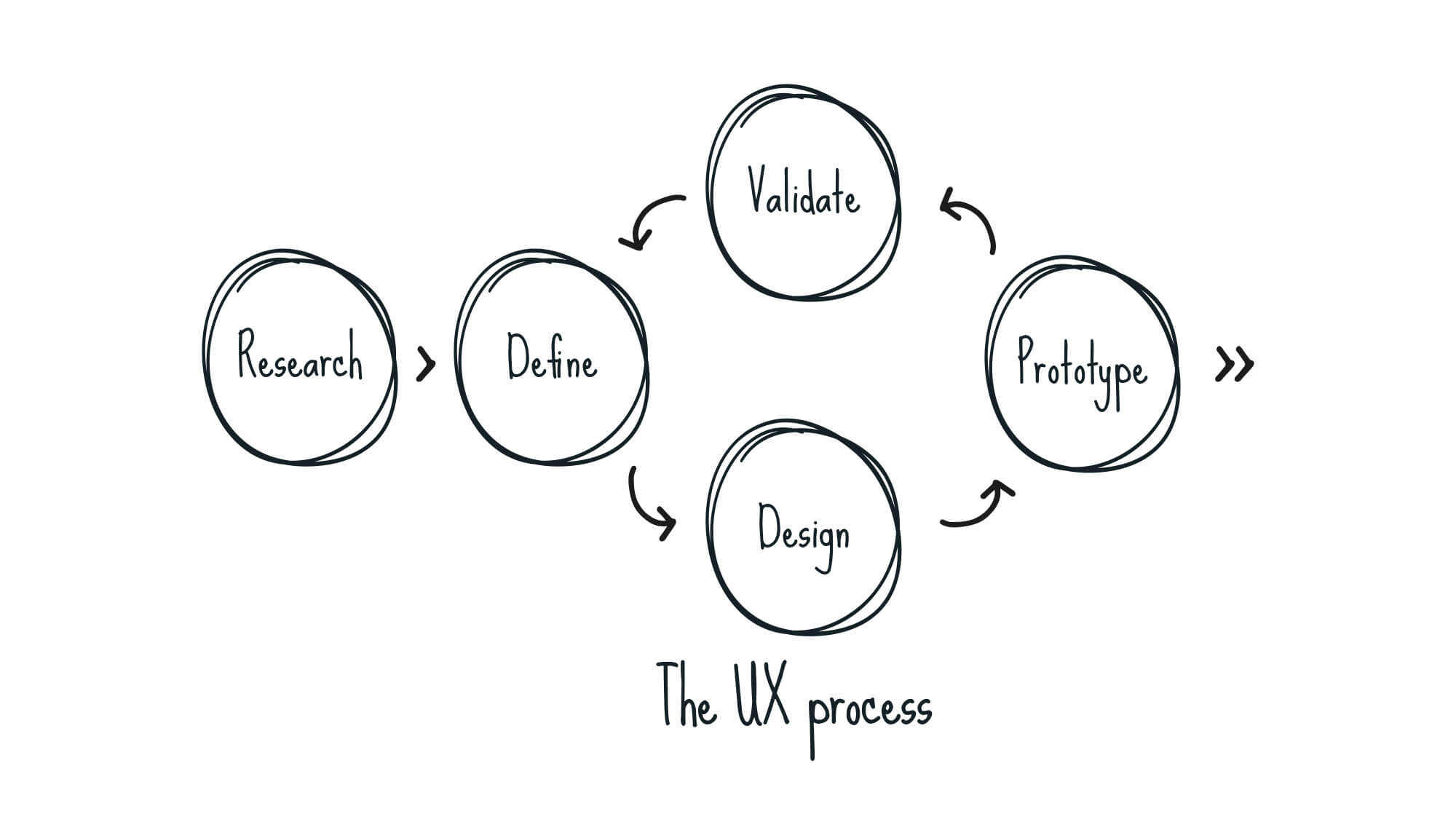
Each phase of the UX process was a journey.
Research. Analysis. Design.
INTRODUCTION
Improving the booking experience
Over the years I have designed websites based on how they look and function. I now wanted to go one step further and get a greater understanding of how the user feels when they use a site.
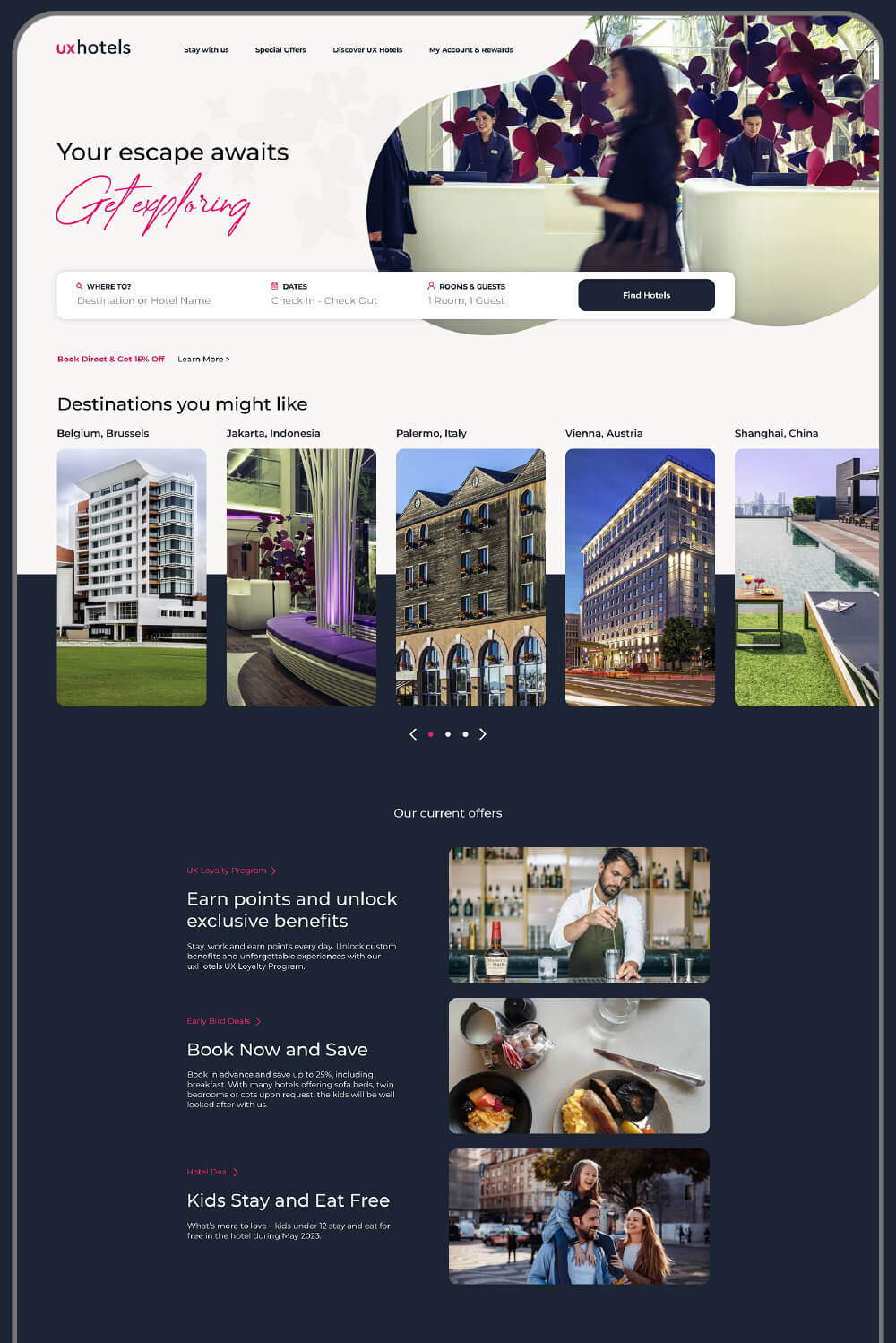
The end goal was to design and build a clickable prototype along with a detailed set of wireframes that could be handed over to a developer.
A hotel website was chosen as I felt I could capitalise on the amount of rich research data I could acquire from friends and colleagues on this subject.
RESEARCH
Learning to define the problem
Competitive benchmarking
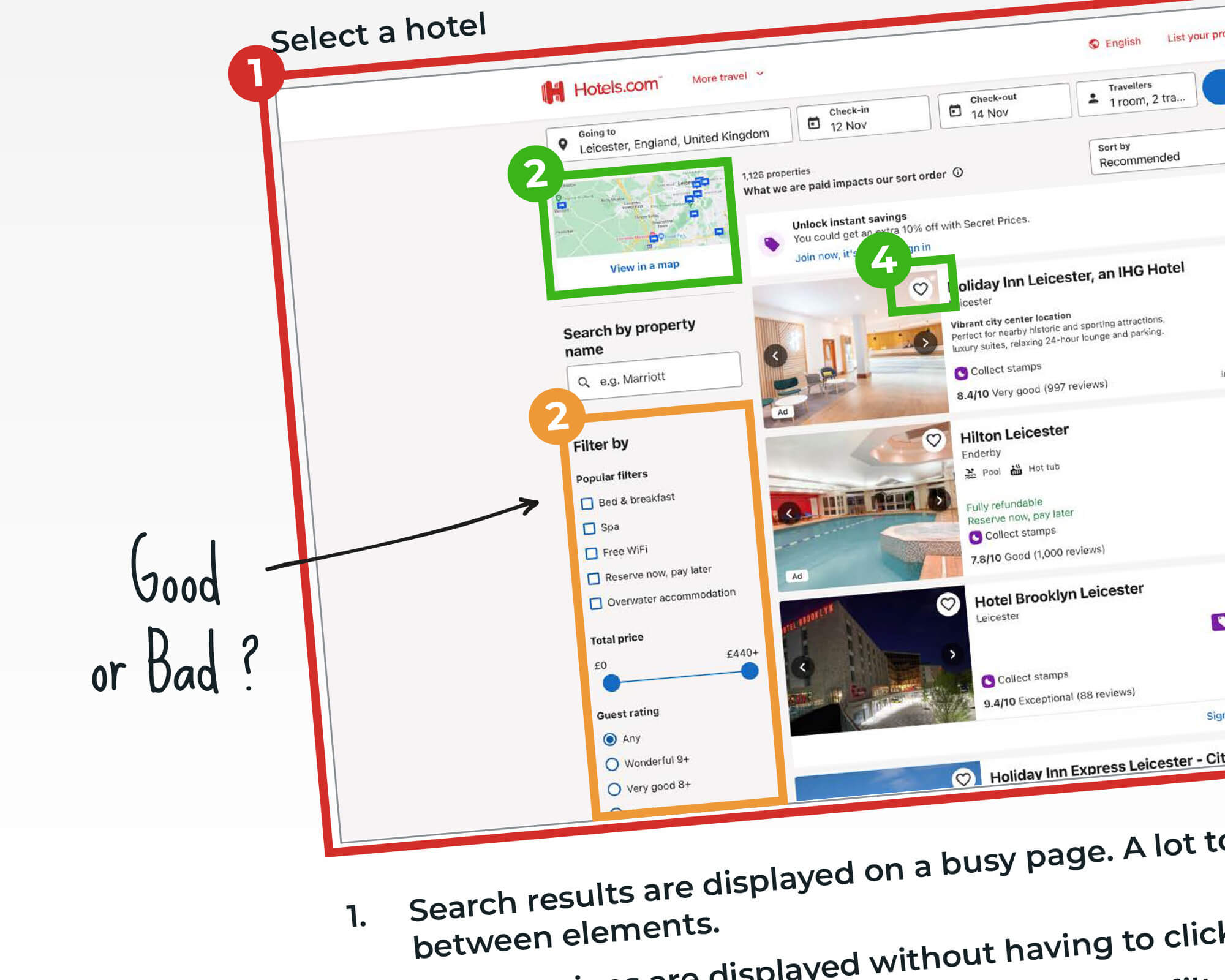
To get a better picture of the problem I was trying to solve I first analysed competitor websites to see how they were handling the booking process.
This gave me some initial ideas and a general grasp of the conventions I should be following. What I didn’t have a clear understanding of was whether certain functionality could be perceived as a positive or a negative. What do people think of anchor buttons that link you to sections of a long page? Where is the best location for search filters – front and centre or less intrusive?
I hoped that direct user research would give me the answers to some of my questions.
ONLINE SURVEY
Getting to know the user
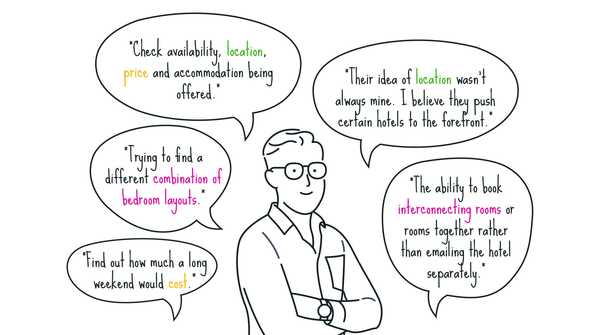
I wanted to know more about people’s experiences of using booking websites and the context in which they used them, so I conducted an online survey. I asked both of qualitative and quantitative questions and the results revealed a few patterns.
USABILITY TESTING
Gaining rich insights
To get the research data I required (and possibly the answers to some of my previous questions) I conducted some usability tests with people who regularly used booking websites.
Prior to the test I conducted an in-depth interview to help gain an understanding of their goals, past experiences and any pain points they encounter when trying to book a holiday online.
I had noticed that each user had their own opinions on what they felt should be on a booking website. I took note of these suggestions and would wait to see if it affected my design decisions later in the process.
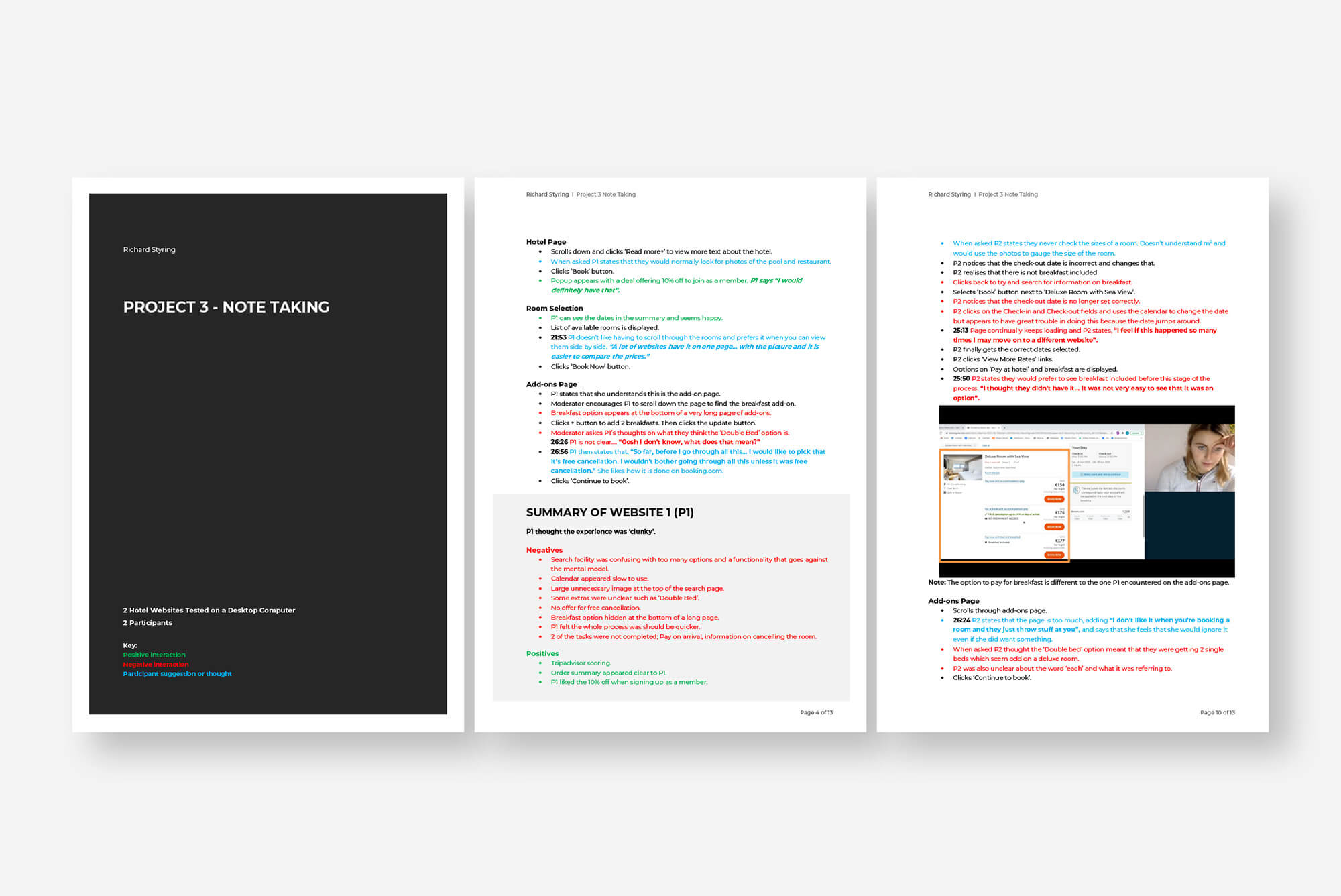
Watch the usability test
Some users felt the process of booking should not display too many options while others felt that it was oversimplified. Getting a balance between the two was going to be an important aspect to consider.
ANALYSIS
Getting to the root of the findings
Affinity diagram session
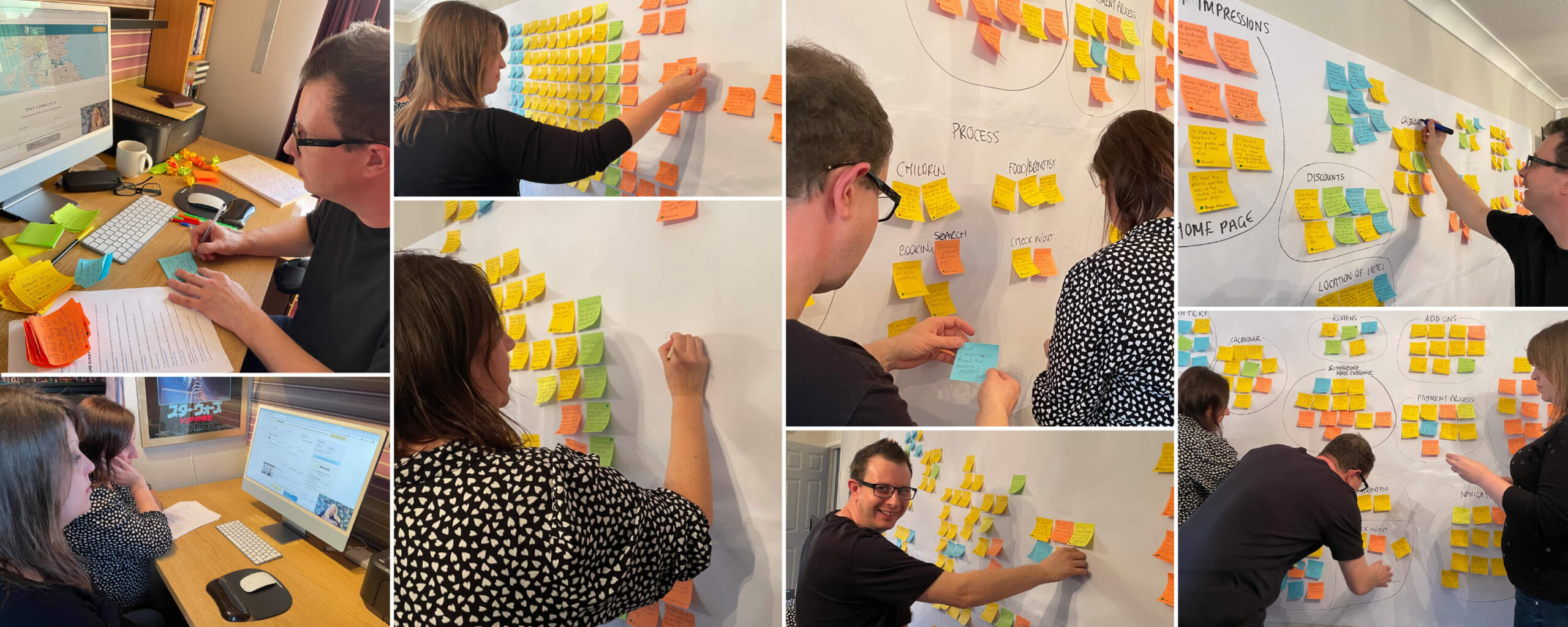
Having initially framed for the problem I now needed to create a full picture though analysis of the data. A vast majority was quantitative data, so to help organise this I used an affinity diagram. I collaborate with others to help me analyse the data. Observations, thoughts and key findings were written on to Post-it notes. During the session these were organised in to logical groups.

The data was reproduced in Miro then sequenced in to chronological order to help build a customer journey map.
CUSTOMER JOURNEY MAP
Seeing it from the users perspective
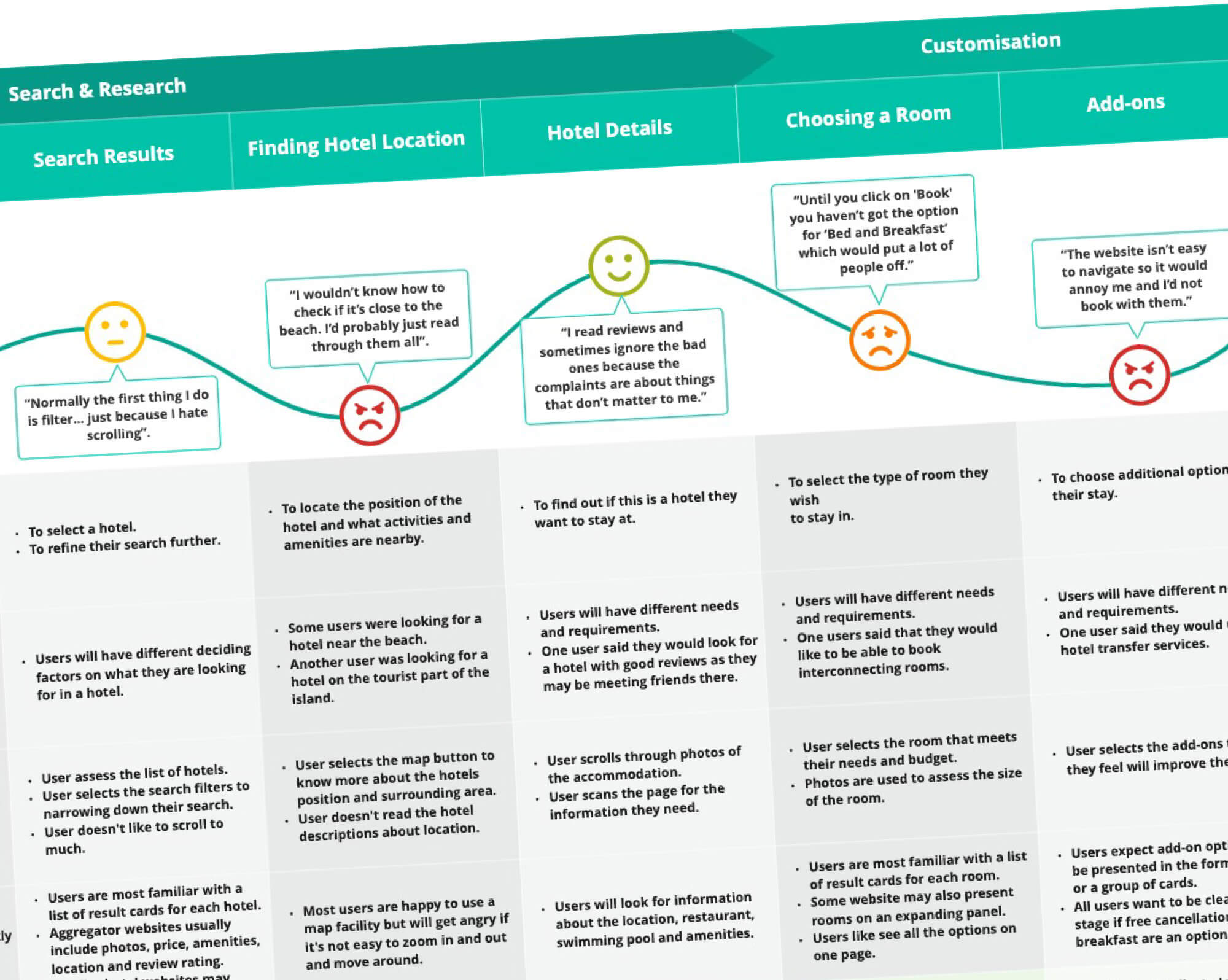
In order to complete the picture and visualise the experience from a users perspective, I created a customer journey map. Based on the data collected I divided the booking process into logical steps. For each step I described the users goal and offered a context in which the step took place. I then documented the users behaviours and expectations for each step and included any positive or negative interactions from the usability tests. To summaries I suggested possibly improvements that could be carried forward into the design.
DESIGN
Solving the problem
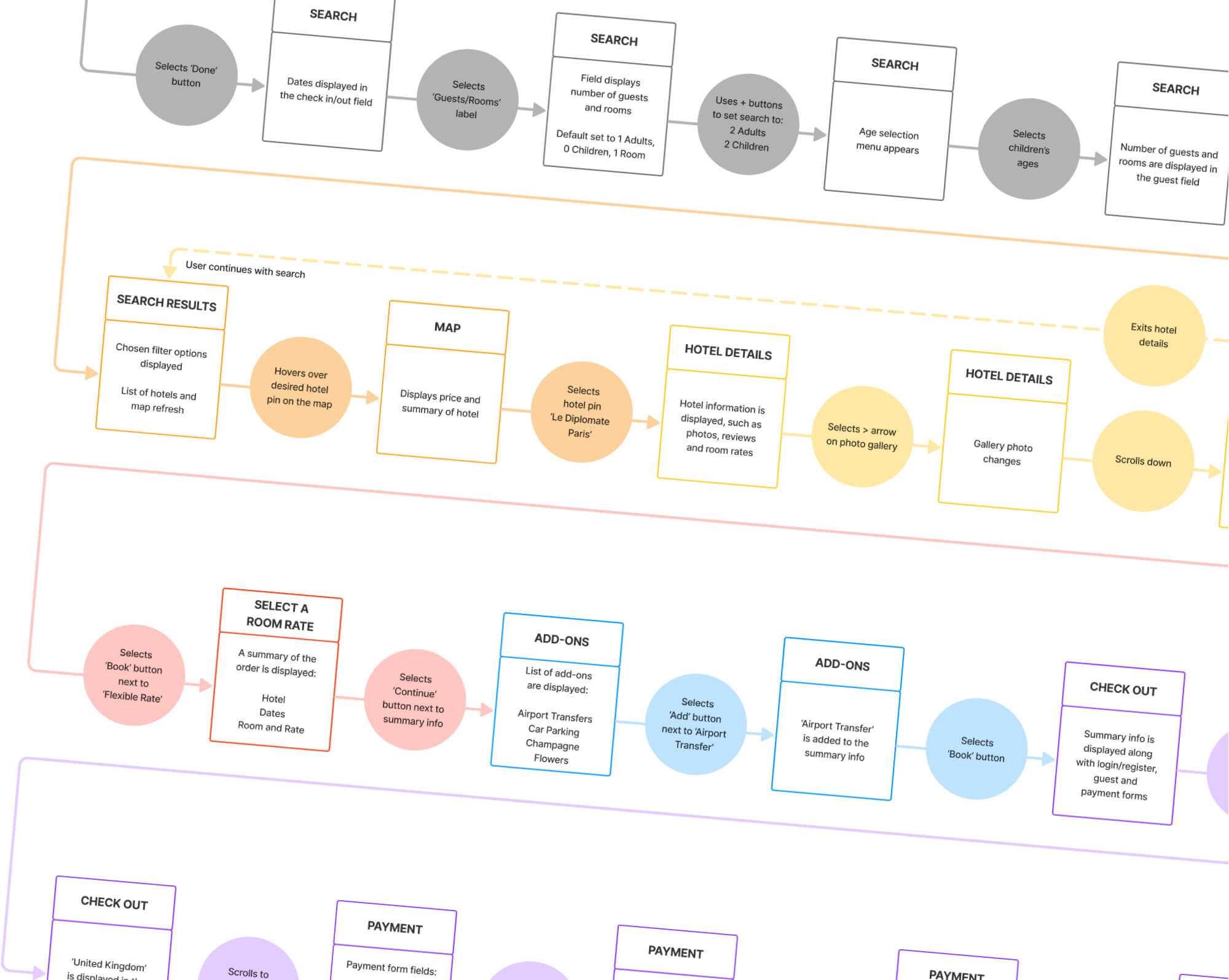
User flow diagram
In order to lay the ground work for the wireframe designs, I needed to define the user’s high-level booking flow. I sketched out the screen states for each of the user’s main interactions of a positive experience or ‘happy path’ through the booking process.
I tried to make the flow as simple as possible while addressing the pain points that were highlighted in the research phase. As I completed the task, it became evident that creating a well designed search and filter facility would be key to making it a smooth experience.
INTERACTION DESIGN
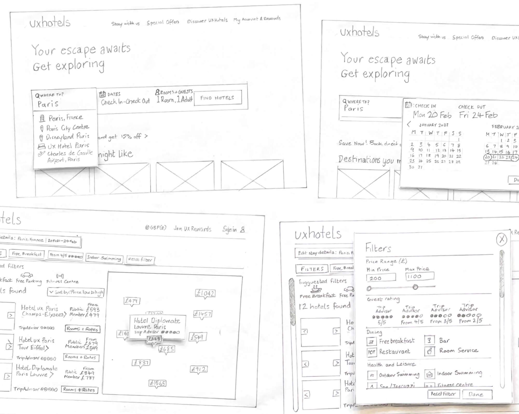
Sketching the screens
I starting sketching out the screens outlined in the flow diagram from the homepage to the payment screen. I considered the design and layout of each screen state when combined with the user’s interactions.
Previously during the usability tests, some users had felt the process of booking should not display too many options while others felt that it was oversimplified. Getting a balance between the two was going to be an important aspect to consider.
As the designs progressed I decided to kept a narrow focus on creating a clear booking process and omitted some of the features, such as favourites and share options, that I had previously planned to include. I would however address some the user dislikes and pain points such as long scroll pages and their struggle to understand the location of hotels.
PROTOTYPING
From page to pixel
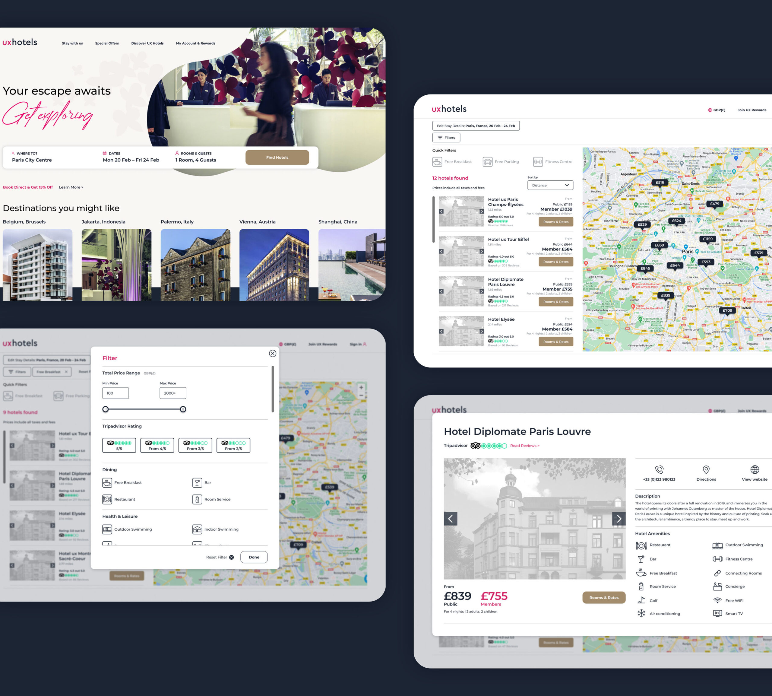
Having established the overall layout with the wireframe sketches the next stage of the process was to build a prototype. I decided to go with a medium to high fidelity prototype, as they have the ability to convey rich interactions to the user and in turn would provide better quality insights.
Once the look and feel of the screens had been created, interactivity was added following the users ‘happy path’ as a guide. At regular intervals during the process the research data was referenced to help guide the final design decisions made.

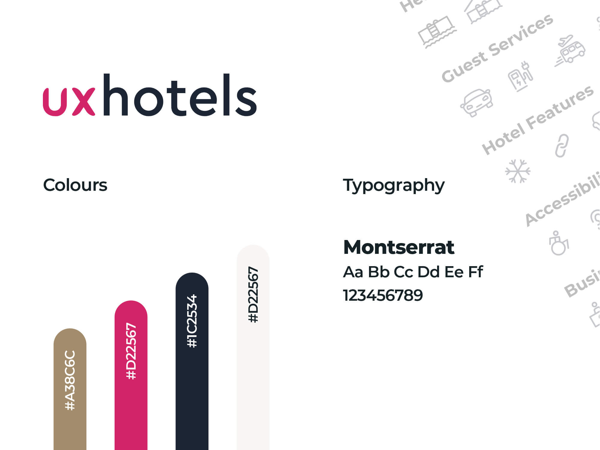
Once the logo and icons had been created in Adobe Illustrator, the wireframe prototype was then produced in Figma.
Watch the prototype
WIREFRAMES
Design to developer handover
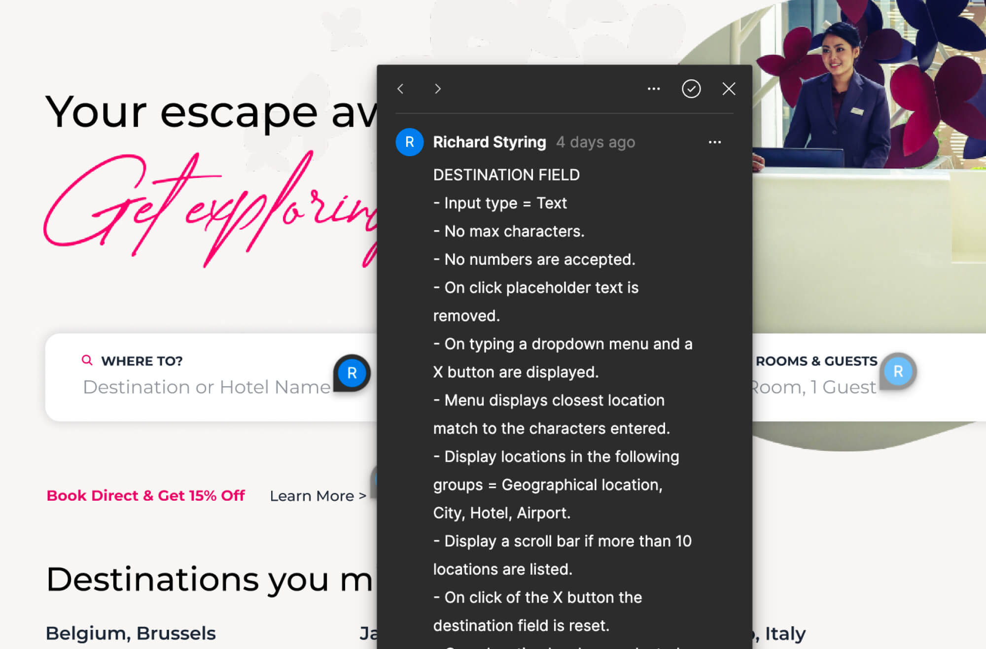
So the project could be handed to developers efficiently, I added annotations to the prototype in Figma. The annotations had to detail enough information to allow them to build an accurate version of the website.
CONCLUSION
Completing the UX process
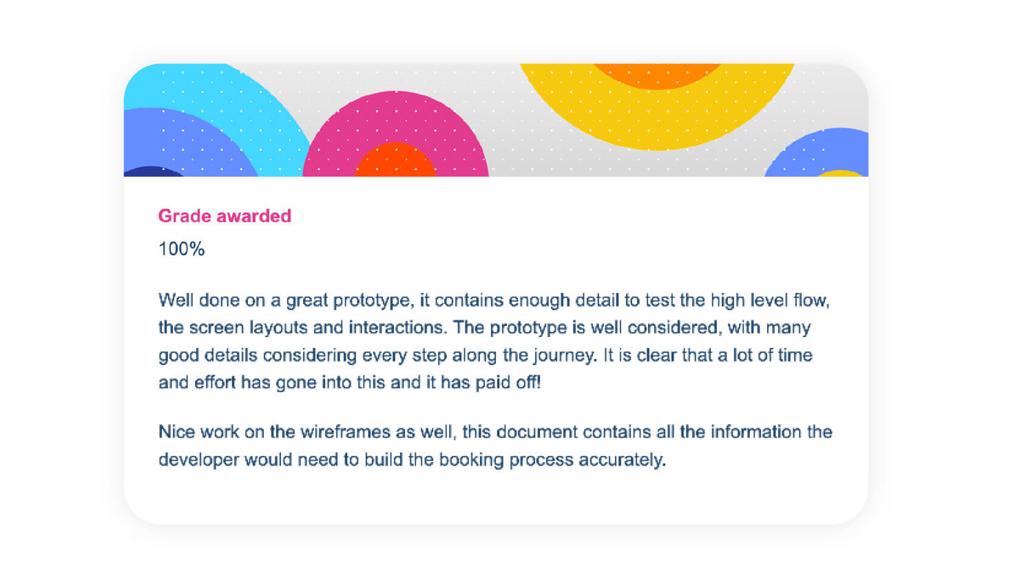
The projects in the diploma gave me hands-on experience of all the key aspects of UX. They gave me a greater understanding of UX as a structured process and taught me not to simply design based on assumptions. I felt I succeed in creating a booking experience that was fast, easy, and intuitive and the assessment feedback reflected that fact.
The project helped me build on my existing skills and knowledge by adding user research and analysis to my designs.
